Display Technology
Bigger isn’t always better: When to say no to a bigger screen
True impact isn't measured in screen diagonals. It's measured in how effectively your screen connects with the viewer in front of it.

October 13, 2026 by Gino Sesto — President, DASH TWO
 ChatGPT
 Grok
Grok Perplexity
 Claude
When most people think about digital signage, they think "go big or go home." From giant stadium boards to street-level marquee displays, scale gets mistaken for success. But deploying massive displays without considering viewing distance and context can waste money and reduce engagement.
creen selection should be driven by audience distance, creative strategy and desired viewer action—often making smaller, close-proximity displays far more effective and ROI-positive than massive marquee screens.
The bottom line: Bigger screens create broad awareness, but smaller, strategically placed screens deliver the intimacy and engagement that spark direct conversions. Here's why.
The role of the massive screen
Massive screens have two main goals — high-level brand awareness and visual landmarking. Think about the places where you frequently see big screens. They aren't available everywhere. In our experience, they are often defined by:
- High-velocity traffic.
- Broad sightlines.
- Crowded squares.
- Highway/roadside placements.
Another downside to the "bigger is better" argument: Large displays dominate sightlines from a distance but lose effectiveness as viewers approach them. They become part of the noise. The message loses relevance up close because it's harder to take in. And the power of that dynamic first appearance loses impact.
The power of close proximity
On the other hand, a message delivered on a smaller screen feels more intimate, more immediate and more impactful.
They excel at delivering direct engagement, dwell-time interaction and conversions.
A 15-inch or 22-inch display placed 3 feet from a customer creates a personal, focused touch point that a 75-inch screen 20 feet above their head can't replicate.
Ideal context for smaller screens
What are the ideal placements for these smaller screens? We have used them effectively in a number of our campaigns, including:
- End-caps.
- Queue lines.
- Kiosks.
- Gas stations.
- Entryways.
- Countertops.
- Fitting room areas.
Designing content for the viewing distance
We've established that good things come in smaller packages. But how can you adjust creative strategy to work for smaller screens? Remember, creative must match the screen size and viewing distance, not just the brand's graphic guidelines.
Larger screens require bold visuals, minimal text (ideally less than five words), and no complex formatting. By contrast, smaller screens are made for up-close moments. They support more detailed messaging, including product details and high-density information that doesn't work well on larger setups. Plus, small screens can feature subtle animation.
Matching message to mindset
When a viewer stands a couple feet from a display, their personal space bubble opens. A small screen at eye level or arm's reach naturally creates a dynamic more like looking at a phone screen or talking to a retail associate. This is why smaller screens feel like a personal recommendation or guided experience.
Large screens come off more like broadcast television or public service announcements. Instead, agencies can tailor small-screen messages to feel more focused, giving them a conversational appeal instead of making people feel "talked at."
Small screens also offer the chance to go beyond hype, which is terrific for broad messaging on big screens but less effective with a more intimate message space. Small-screen advertising can convey specific product details, ingredient breakdowns, customer reviews or pairing suggestions to establish trust with the viewer.
Driving action: Why CTAs shine on smaller displays
This lesson can only be learned through firsthand experience, so trust our hard-earned fails: QR codes, web URLs, touchscreen prompts, and NFC tags are ineffective on massive overhead displays because of the wide physical gap. Scanning a QR code from far away demands camera zooming that distorts pixels and causes scanning failures.
Plus, viewers rarely want to point their phone cameras upward in a busy crowd to capture a code on a public board. They don't want to cause a traffic jam by slowing people behind them when it takes too long to line up the shot.
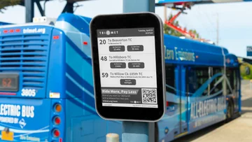
By contrast, moving displays closer to a viewer's field of vision eases the barrier to action. Smaller displays at eye level or arm's reach invite immediate physical and digital interaction. For instance, a QR code on a 10-inch counter display produces significantly higher scan rates than the same code high on a wall screen.
Stop asking viewers to jump through physical hoops and give them a smoother path to engagement. Bringing the screen closer removes both the physical distance and cognitive effort required to move from noticing an offer to completing a sign-up, transaction, or download.
Choose the best size, not the biggest
Don't let screen size become a vanity metric. Right-sizing your digital signage network maximizes audience impact and equipment budget. Use this decision framework checklist to guide your size decisions:
- What is the goal? Awareness Go bigger. Action Bring it closer.
- Where is the viewer standing? Match screen size to sightline distance.
- Is there a CTA? Keep it within smartphone or arm's reach.
Remember, true impact isn't measured in screen diagonals — it's measured in how effectively your screen connects with the viewer in front of it.
About Gino Sesto

Related Media
Subscribe
Get the latest news and resources from Digital Signage Today.