Article
How to decide on colors for digital signage
The art director at Noventri Digital Signage talks about how to choose which colors work best together in digital signage applications.
 ChatGPT
 Grok
Grok Perplexity
 Claude
If you've ever had trouble deciding what colors look good when you're creating your digital signage content, this article is for you. And remember, once you practice enough with color in digital signage it will start to feel like second nature.
The first thing we'll talk about is color and light. If you already know and understand color, and you'd rather just know which sets look good together, feel free to skip ahead.
There are two types of light you deal with every day: additive and subtractive. If you're reading this post on a computer screen, you're dealing with additive light. If you printed this post out, and are reading it on paper, you're dealing with subtractive light.
Additive light is projected light, and is comprised of the primary colors of red, blue and green. That's why when you get really close to your television you see red, green and blue pixels, or spots of light. The computer screen is projecting light which your eye is then receiving. Digital signage is additive light.
Subtractive light is reflected light, and is comprised of the primary colors of red, yellow and blue. You may remember learning your primary colors in middle school art class. Technically, if you're wearing a green shirt, and that shirt looks green to you, it's because green is the only color of light that is being reflected off of your shirt and into your eye. We could go into more detail, but since digital signage deals with additive light and paper signage deals with subtractive light, we don't need to elaborate any more.
Even though your digital signage screen might technically be making your colors out of red, green, and blue (RGB) pixels, it's much easier to think of your colors in three different parts:
Saturation is how "strong" a color is. To better explain, imagine the grass outside your house in summer. The grass is a very strong, vivid green. As summertime fades and fall arrives, the green loses a bit of color. Finally, when winter arrives, grass will commonly lose most of its green coloration. This is saturation. Here's another example: imagine you have a glass of milk and some blue food coloring. The milk starts off as white, but for each drop of food coloring you add, the milk becomes more blue, or more saturated. In the Noventri Designer custom color picker, as well in Microsoft Windows, saturation is on a range from 0-240.
Luminance is how much white or black is mixed with your color. You probably already refer to colors as light and dark; this is what luminance is. Some colors have more common or widely used names. Blue, for instance, becomes "baby blue" when its luminance is increased. When orange's luminance is decreased, it becomes brown. In the Noventri Designer custom color picker, as well as in Microsoft Windows, luminance is on a range from 0-240.
It is good to think of your colors in reference to these three parts, and it can really help you describe colors to other people better than just saying "red" or "blue." An evergreen tree could be a low luminance, low saturation green; the sky on an overcast day could be a high luminance, low saturation blue; and the highlighter at your desk could be a high luminance, high saturation orange.
Now that you have a better understanding of color, the second thing we'll talk about is what colors look good together.
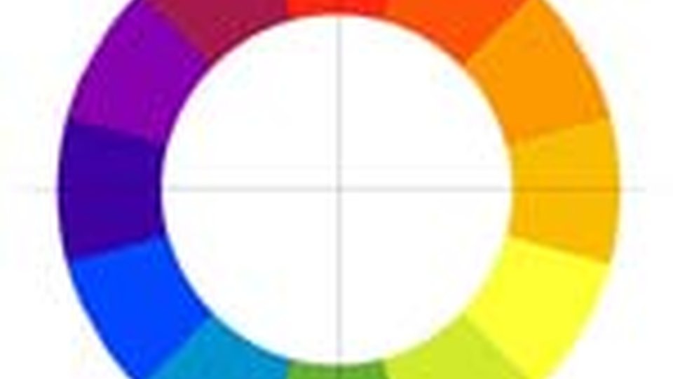
Picture a wheel of color like a clock face: red at 12 o'clock, red-orange at 1, orange at 2, yellow-orange at 3, yellow at 4, yellow-green at 5, green at 6, blue-green at 7, blue at 8, blue-violet at 9, violet at 10, red-violet at 11 and back to red at 12. If you can imagine a line running through the middle of that color wheel, connecting one end to another and passing through the very center of the circle, then you can make good color choices in digital signage. It's that easy!
You'll notice that red is directly across the circle from green, orange is directly across the circle from blue, and yellow is directly across the circle from violet or purple. These colors look good together because they are pure opposites, and when used together in digital signage you're sure to get more positive attention than using two colors that don't go so well together.
(White and Black are interesting because they can be combined with just about any other color and look good. Use your best judgment based on readability; you already know that yellow text on a white background is nearly impossible to read, just as rich blue text on a black background is.)
You're probably thinking, "What if I want to use more than two colors?"
Side notes: Red Text Rule: The color red, especially when used as thin text, can generate some unwanted noise and lack of detail. If you've ever seen a television commercial with red text that's hard to read, you know what I mean. By red, I don't necessarily mean a high luminance red (like pink), and I don't necessarily mean a high saturation, low luminance red (like maroon or burgundy). It's generally a good idea to avoid the bright "fire-engine" reds, especially when using thin text. Readability: Generally, the more contrast between the color of your content's text and the color of the background behind it the more readable your text will be. Black text on white or white text on black is about as readable as it gets. Just because two colors contrast one another, or are complimentary, does not mean they'll look good used in conjunction with backgrounds and text. Take red and green for instance; not only does it immediately evoke feelings of Christmas to some viewers, but it's downright difficult to read red text on a green background. To increase readability with complimentary colors, just darken one color and brighten another. For instance, put light red text on a dark green background, or vice-versa. |
You may also be thinking, "Well, that doesn't leave me with too many options." Remember what we covered in the first section about what makes up a color? By choosing color compliments we are only altering the hue; you can alter the saturation and luminance to get endless combinations of complimentary, good-looking colors. For best results, if you use high saturation and luminance in one of your colors, use low saturation and luminance in your other color.
Finally, we'll talk a bit about the emotional responses tied to each color. These emotional responses are better known by the marketing crowd and are used daily in advertising to evoke certain responses from you, the viewer. Some are more obvious than others. Depending on your industry, you may want to take a risk and get away from your company colors on your digital signage to use something more emotion-evoking. Below is a list of pure hues and a few emotions and words associated with each:
Red - Passion, Violence, Fire, War, Love, Danger
Related Media
Subscribe
Get the latest news and resources from Digital Signage Today.
Recent Posts