Blog
Spelling out typography in digital signage
It's not just what you say or how you say it; how what you say looks matters more than you might think.
November 6, 2014 by Kelly Eisel — Copywriter, Industry Weapon
 ChatGPT
 Grok
Grok Perplexity
 Claude
By now you're on your way to becoming design professionals (if you've read all our design blogs). We understand why design is vital to your digital signage campaign, and even better, we know how to avoid common design mistakes. We've discussed how to put in place best practices that drive audience engagement, and which color choices are best for your digital signage messages.
This brings us to our fifth design blog: typography for digital signage content design. A huge part of digital signage content design is function, and the function of digital signage is to communicate a message to your audience. So, the text of your message is extremely important. Typography can make or break your design. If no one can read your message, what's the point of displaying it in the first place? The good news is, simple practices will keep the text of your campaigns readable and effective for as long as you use them.
Be choosy with your typeface
Unless you're using a handheld smart device, your audiences are going to be viewing your signage from a distance (usually 5-10 feet away). Because of this, you'll want to consider the type of font used for your messages. Text should stand out, not strain the eyes of the viewers. An easy-to-read san-serif typeface will translate well in any setting. The most commonly used sans-serif typefaces for headlines are Arial (28 percent), Helvetica (20 percent) and Verdana (8 percent).¹
Try to limit texts to two or three different type faces and styles, per slide. This means that the body should all be one font and size, but the title can be something more experimental — as long as it is readable. Don't be afraid to make these fonts noticeably different from each other. Using two similar fonts can look like you made a mistake and chose the wrong font.
Size matters!
Just like typography, the size of the type plays a huge role in your messages' readability. The further your screen will be from the audience, the larger you need to size your text. Lobby signs are usually positioned10-15 feet away from viewers, but digital signs in data and call centers are usually 30-50 feet away. The chart below is a good reference point for type size to distance ratio for best readability:

Kill unnecessary characters
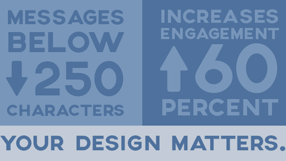
Just like an HBO special, too many characters causes confusion. The same rule applies to digital signage messages. The shorter the message, the easier it is for the audience to digest. Messages below 250 characters boost engagement rates to 60 percent.² Remember, you only have about 3-6 seconds to capture their attention anyway. A paragraph of text will actually divert their gaze, resulting in a disengaged viewer. Try to break up longer messages onto multiple slides and try to keep the character count limited to 55 to 85 per line.³

Alignment is key
Spacing is important to any design. Cramming your text to one side, or to the top, of the signage will look unprofessional. Text should never touch the outer perimeter of the screen or any images. The trick is to space out your lines of text inside of a mental margin while keeping the lines aligned.

Spacing between headlines and body copy should be the distance of one line of copy. Add more space between body copy end and the next headline. A good rule of thumb would be to space out the height of two additional lines of copy.

Note the uneven spacing and alignment of text. It is imperative that the spacing between type is uniform to ensure a solid layout.
Remember, messages are the main function of digital signage. If you keep them short and sweet and easy to read, your signage will always be on the right path. Stay tuned for more tips and information on how to utilize best practices for your digital signage content design, without the $100k graphic design degree.
Sources: 1 - Smashing Magazine; 2 - Buffer; 3 - Smashing Magazine
About Kelly Eisel

Related Media
Subscribe
Get the latest news and resources from Digital Signage Today.
Recent Posts