Commentary
'I'm liking it:' Reviewing McDonald's menu boards
Recently, I made a trip to the Golden Arches, not just to get a burger, but also to see if the restaurant's menu boards lived up to the hype. I examined them on the basis of visual content, presentation and readability to see if they earned my 'I'm lovin' it' seal of approval.
November 10, 2017 by Bradley Cooper — Editor, ATM Marketplace & Food Truck Operator
 ChatGPT
 Grok
Grok Perplexity
 Claude
Recently, I made the all too familiar desperate trip to the Golden Arches to get a small item off the menu. McDonald's isn't exactly my first choice for any reason, but as I was visiting there, I thought I would take a look at its menu boards to see how they held up. I examined the boards based on the visual content, presentation and readability to see if I could give it the "I'm loving it" stamp of approval.
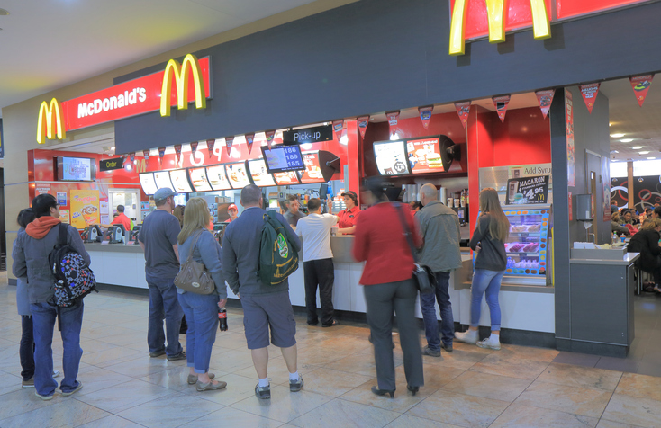
Visual content
The content was spilt between five screens, four in the center above the front, and one off to the left adjacent to the main four.
The center-left screen displayed an attract screen that looped animations such as coke slowly pouring into a cup or a fancy coffee. The other three center displays contained a variety of menu items such as the standard Big Mac fare and the all-day breakfast menu.
Images of Big Macs and specials also continuously looped on the center displays, although the images themselves were high resolution, they did not particularly pop off the menu boards. Nothing seemed particularly special about them in other words, no extra brightness or animations.
Overall, the imagery on the displays fit the bill, but it didn't exactly blow me away.
 Presentation
By presentation, I mean the overall appearance of the menu boards. The menu boards were positioned fairly close to each other, so there were no large gaps between them. However, each display featured fairly large bezels, which could be a bit distracting if you were rapidly looking from screen to screen.
I did notice a small issue with cable management in the displays. While most of the cables were hidden, there were small bundles of cables hanging below two of the displays. It wasn't a huge distraction, but it likely could have benefited from more cable management to keep them all hidden.
Readability
The four main displays were all fairly readable. I could easily tell what the menu items were and the prices. However, the adjacent display positioned to the left — used for Happy Meals and the value menu — was another story.
For one, it was difficult to see depending on where you were in the line. It also looped past two separate menu lists quickly, making it difficult to see what you wanted.
Another issue was that the text appeared to be much smaller on this display because it had more items on it. I had to look very carefully to see the actual price of each item because all the text was rather crunched together and small.
Conclusion
If I were to give the menu boards a grade, it would be a solid B. They did the job properly, displaying all the key items and offering some nice visuals. The areas for improvement would be:
- Invest in bezel-free displays and get better cable management.
- Improve the readability of the adjacent display.
- Design visuals that really pop off the screen.
When they do these things, I'll change my opinion from "I'm liking it" to "I'm loving it!"
Image via Istock.com.
About Bradley Cooper
More From CommentaryMore
Related Media
Subscribe
Get the latest news and resources from Digital Signage Today.
Recent Posts