DOOH Advertising
The psychology of color in outdoor retail signage
Here's a close look at the psychology behind color choices in outdoor retail signage so that you can enhance your brand identity.
February 4, 2026 | Amy Plesz/DSA Signage
 ChatGPT
 Grok
Grok Perplexity
 Claude
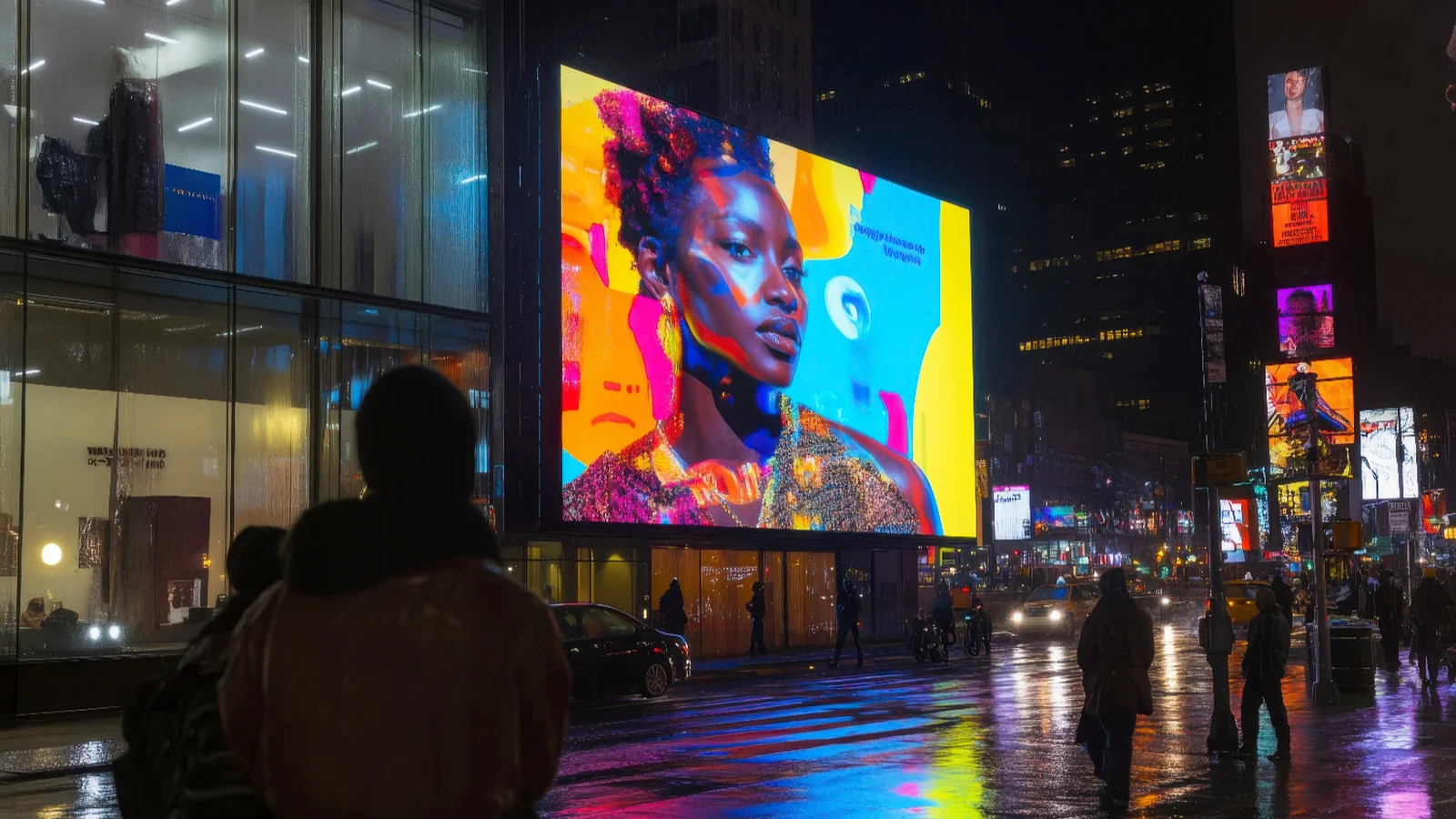
Color plays a crucial role in marketing and branding. You've likely built your brand around a unique logo and specific color scheme, and in outdoor retail signage, color is more than just an aesthetic choice. It's an opportunity to reinforce your brand and engage customers.
The right color choices can serve as a psychological trigger that can attract potential customers and evoke powerful emotions. Take a closer look at the psychology behind color choices in outdoor retail signage so that you can enhance your brand identity.
The science behind color psychology in marketing
Color psychology is the study of how the human brain responds to different colors. In outdoor retail signage, colors can influence customer decision-making and have a positive impact on recall. You can even alter a person's buying habits with the colors you choose.
Key factors that contribute to the effectiveness of color in outdoor retail signage can include:
- Emotional Triggers: Different colors elicit specific emotions that can shape consumer behavior.
- Contrast, Brightness, and Saturation: Using adequate contrast and saturation makes outdoor retail signage more readable.
- Cultural Differences: Color associations may vary across cultures, so you will need to consider the cultural context when choosing signage colors.
For example, red is often associated with a sense of urgency, while blue conveys trust or reliability. A common cultural difference in colors is the symbolism of white. In Western cultures, white is often associated with purity. On the other hand, some Eastern traditions associate white with mourning.
Make sure to keep in mind who your audience is so that you can adapt your outdoor retail signage to the preferences of your target demographic.
Choosing the right colors for your outdoor retail signage
There is no such thing as a one-size-fits-all color scheme for outdoor retail signage. Here are some colors to consider and how they can impact consumer perception of your business:
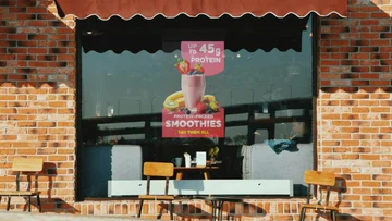
Red
Red is a powerful color that commands attention and stimulates a sense of urgency in your audience. Businesses often use red to promote sales and clearance events. The color is known to:
- Evoke excitement and energy.
- Stimulate appetite.
- Encourage impulse purchases.
- Create a sense of urgency in sales promotions.
If you want to make your audience feel like they might miss out on a great deal, or you need to elicit feelings of excitement, red is a great choice.
However, it's important not to overuse red. You should incorporate red into the aspects of your signage to which you want to draw the most attention. For example, bordering a clearance event announcement in red can create a sense of urgency.
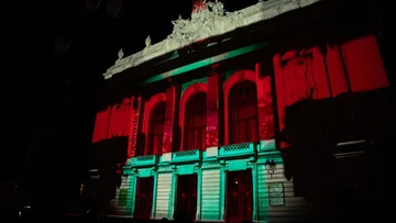
Blue
Consumers often associate blue with trust and calmness, depending on which shade of blue they see. You can also use blue to showcase your professionalism. Some industries that commonly use blue include the following:
- Finance.
- Technology.
- Healthcare.
Lighter or softer blues can create a calming effect. Bolder blues speak to your company's professionalism and convey reliability. Strategically incorporate different shades of blue into your outdoor retail signage to influence how customers feel about your brand and products.
Yellow
Yellow is an attention-grabbing color that can promote optimism and enthusiasm. It is often used in signage for clearance sales and impulse-buying promotions. Yellow is effective because it:
- Captures attention quickly.
- Evokes feelings of happiness and positivity.
- Stimulates mental clarity and decision-making.
However, like red, yellow can be powerful and even a bit overwhelming. Make sure you use yellow sparingly to avoid overwhelming your audience or distracting from the messaging of your signage.
Experiment with different signage layouts and designs, especially when using colors like yellow. See how the designs make audiences feel and whether they can focus on all pertinent information in your graphic.
Green
Consumers associate green with nature and health. It has also become synonymous with sustainability. If organic products and eco-friendly practices are some of your company's core value propositions, then you'll want to consider using green in your outdoor retail signage. Green is also a great tool for creating a sense of balance.
Black & White
A combination of black and white offers a classic, sophisticated look. High-end retail and luxury brands often rely on this color pairing to speak to their sophistication. Some of the benefits of black-and-white signage include the following:
- High contrast for easy readability.
- A sleek and elegant aesthetic.
- Timeless appeal suitable for premium brands.
However, black and white isn't only reserved for high-end brands. Even if your business offers more accessible products and services, you can use black-and-white to create contrast and promote readability. Using white negative space is also a great way to let your signage breathe and ensure it isn't too crowded.
Related Media
Subscribe
Get the latest news and resources from Digital Signage Today.