Content
Common UX problems with digital signage
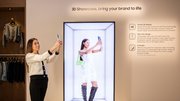
The next phase of digital signage won’t be defined by screen quality or scale. It will be defined by how well networks deliver clear, relevant and actionable experiences in real-world environments.

April 17, 2026 by Gulfiia Malakhova — CEO and Co-founder, Buzzblender
 ChatGPT
 Grok
Grok Perplexity
 Claude
Digital signage continues to expand across retail, hospitality, healthcare and corporate environments. The global market is on track to exceed $45 billion by 2030
But growth in hardware hasn't translated into growth in effectiveness.
Many networks look modern. Few perform that way.
The issue isn't infrastructure. It's execution — specifically, user experience.
Too often, digital signage is treated as a content distribution tool rather than what it actually is: a real-world communication interface competing for attention in busy environments.
Based on what we're seeing across deployments, here are five UX issues that consistently limit performance — and what operators can do about them.
Too much content, not enough clarity
A common mistake is trying to maximize screen "usage" by fitting in multiple messages, images, and videos — essentially trying to show everything at once.
In practice, that reduces impact.
Most viewers engage with signage for only a few seconds. During that time, they're not reading — they're scanning. If the message isn't immediately clear — or if it feels overwhelming — it gets ignored.
Effective networks simplify:
- One message per screen.
- Short headlines.
- Strong, clear visuals.
- Around 15–20 seconds per screen.
That's often enough to drive results.
For example, people eat with their eyes. Juicy add-on visuals — like sauces, bacon, or melted cheese — can increase the average check by around 10%. You don't need complex videos with people. Showing the product clearly at the right moment is more effective.
Content isn't designed for the environment
Digital signage doesn't exist in a vacuum. It lives in physical spaces with different conditions:
- Distance from the screen.
- Lighting.
- Movement.
- Dwell time.
Yet content is often reused across locations without adaptation.
For example, messaging designed for a waiting area (longer dwell time) will under perform in transit or storefront environments where attention is measured in seconds.
Motion is overused
Animation is a powerful tool — but only when used with intention.
In many cases, screens cycle too quickly or rely on excessive motion that competes with the message itself. If key information isn't visible long enough, it simply doesn't register.
A more effective approach:
- Keep transitions simple.
- Ensure core messages remain on screen for several seconds.
- Use motion to direct attention, not decorate content.
This is especially important in high-traffic environments where timing is critical.
Engagement opportunities are missed
One of the biggest shifts in digital signage is the move from passive viewing to active engagement.
However, many deployments still function as one-way channels.
That's a missed opportunity.
With the widespread adoption of mobile, simple tools like QR codes can connect physical screens to digital experiences—promotions, product information, or transactions.
Importantly, this no longer requires complex infrastructure. Generate QR-based interactions directly within your digital signage platform.
Content strategy driven internally, not externally
In many organizations, digital signage becomes a shared channel for multiple stakeholders.
The result is familiar: crowded screens with competing priorities.
High-performing networks take a different approach. They define:
- A clear objective for each screen.
- Ownership and governance.
- Success metrics tied to user behavior.
Instead of asking, "What do we want to show?"
They ask, "What does the viewer need right now?"
That shift makes a measurable difference.
Final takeaway and recommendations
The next phase of digital signage won't be defined by screen quality or scale.
It will be defined by how well networks deliver clear, relevant, and actionable experiences in real-world environments.
Here's a simple checklist to keep your screens performing:
| Step | What to do | How to do it | Quick check |
| 1. Goal | Define what this screen should achieve | Sales, upsell, awareness, navigation | Is there ONE clear goal? |
| 2.Message | Focus on a single idea | One product, one offer, one action, 6–8 word headline | Can it be understood in thre seconds? |
| 3. Visual | Use a strong, eye-catching image | High-quality product photo, close-up, minimal distractions | Does it grab attention instantly? |
| 4. Location | Adapt content to environment | Consider distance, lighting, and dwell time (fast vs slow spaces) | Is it readable from where people stand? |
| 5. Result | Measure performance | Track sales, QR scans, engagement, conversions | Is it driving action? |
About Gulfiia Malakhova
Gulfia is a CEO and product leader specializing in AI, product management, and operating systems. She was previously CPO at Ogram and worked on subscription models at Flo Health (400M+ downloads). She led AI product development at Retail Rocket and completed Harvard’s Introduction to AI with Python. Gulfia launched her own Android-based OS (OnewayTV) and is the founder of Buzzblender, a digital signage platform. She has deep expertise in WebOS, Android, Tizen, and system integrations, including hands-on work with Chinese manufacturers.
Related Media
Subscribe
Get the latest news and resources from Digital Signage Today.